UX Design | Concept design
Mobile app: Plante
Overview
Time: May 2020 - Nov 2021
Team: 2 people
Role: Research, Concept design, Prototype & Concept validation, UX/UI design
Challenge
A plant that is not able to thrive at home can make plant parents feel frustrated and discouraged. One of the reasons is insufficient home conditions and environments for plants.
Goal
We want to help people from the get-go to easily find suitable plants for their homes’ environments and conditions.
Research
8 interviews conducted - 5 plant apps studied
Insights
2 main types of behaviors: research before buying and research during/ after buying
Most essential criteria when choosing plants: easy to care for, amount of required water, sunlight & temperature, prices, and pet-friendly
Existing apps focus mostly on plant care process such as identifying plants and their problems, reminder or carding guide and plan
Since most participants are foreigners, they face language barriers when searching for needed information
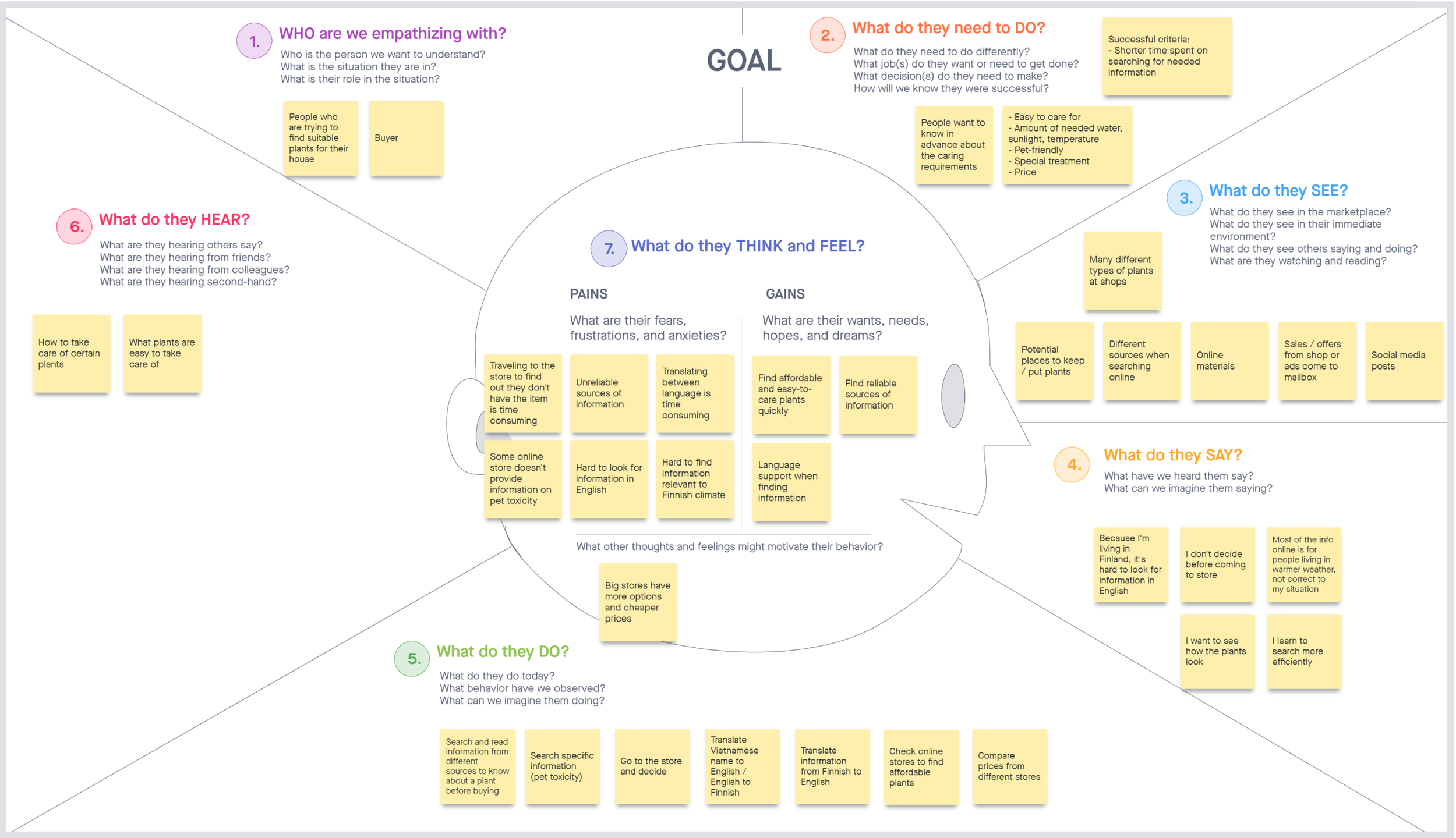
We create an empathy map to understand and empathize with participants’ pain points when they decide to buy plants.
Personas
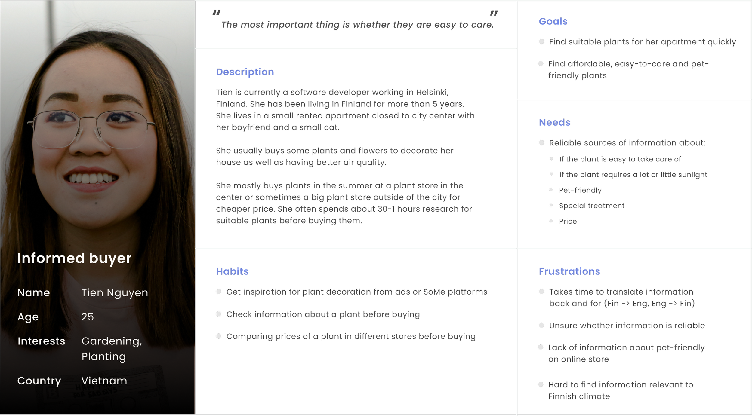
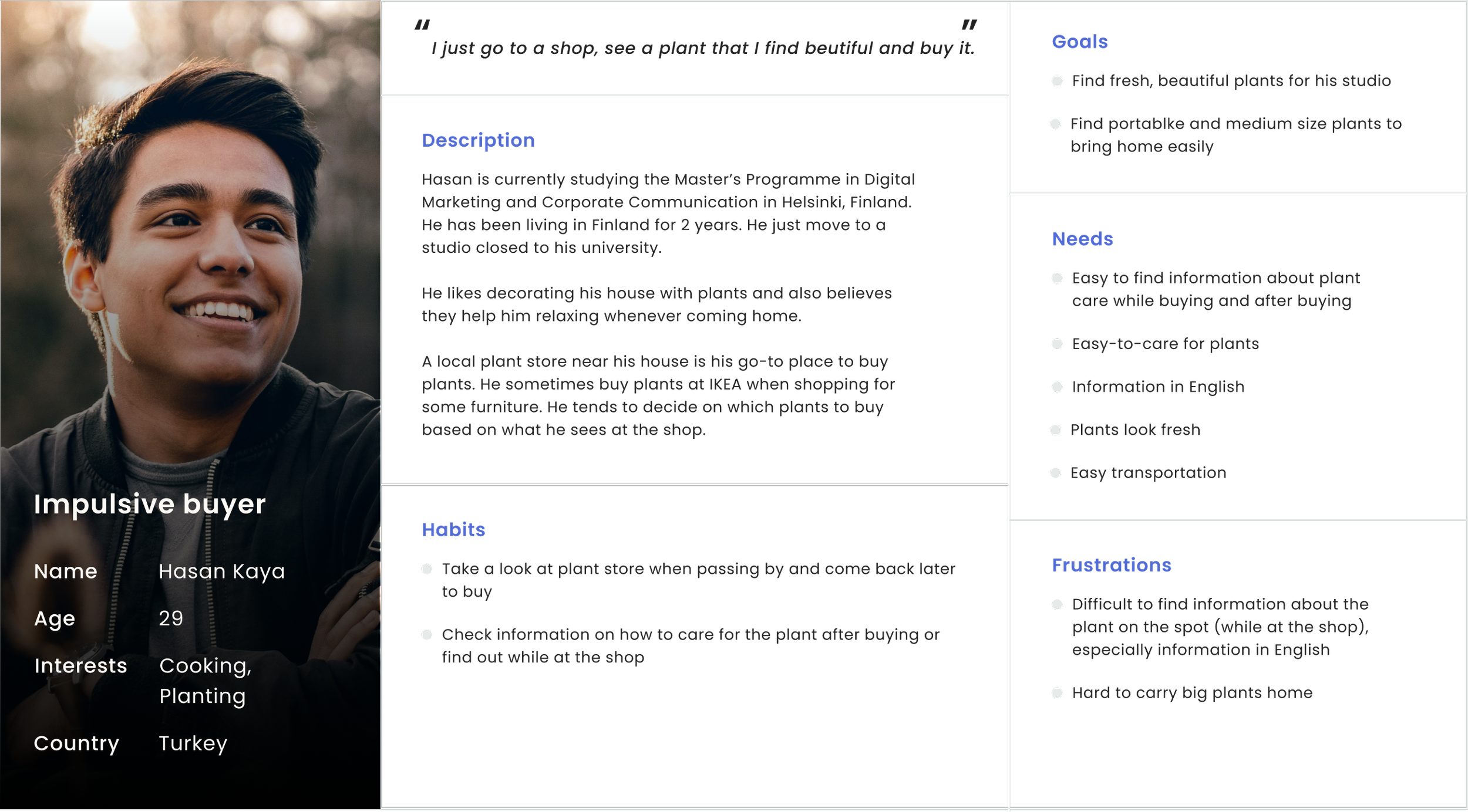
2 personas were created to identify our target users.
Ideation
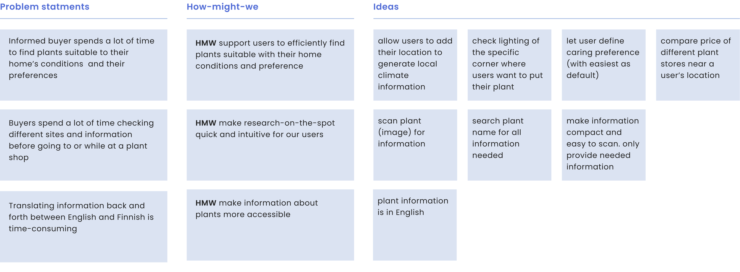
Problem statements & How-might-we
We formulated the main problem statements based on the goals and frustrations of plant-buyers during their research & buying process and generated a variety of ideas using How-might-we methods
Task flow
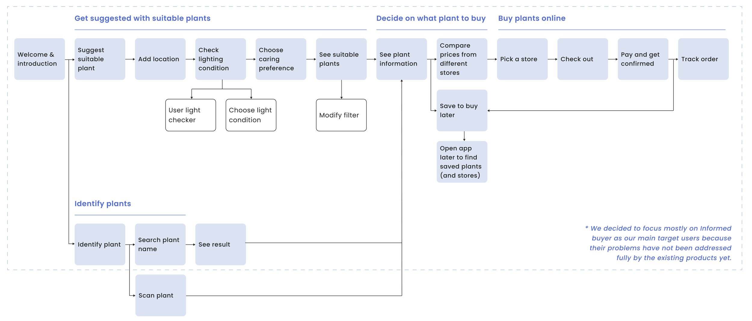
The task flow summarizes the main process of finding and buying suitable plants for their house as well as the main features of our app.
Wireframe
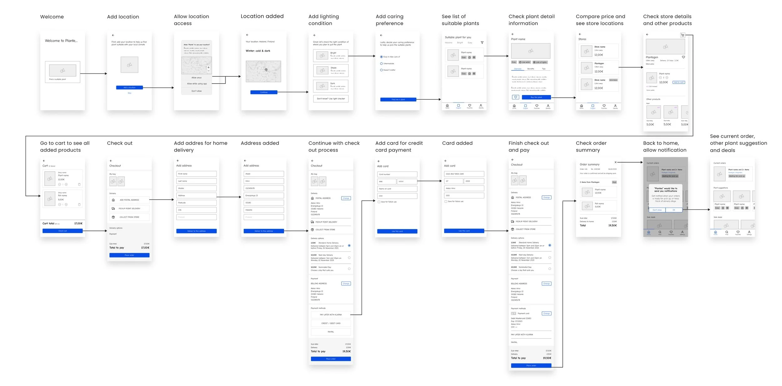
We moved on lo-fi wireframing for an MVP in order to quickly validate our concept and discover whether we are solving the right problem and with the right solution.
Concept validation
Hypothesis
We validated the design in the early stage with 4 informed buyers (2 from the previous interview) with the following hypothesis:
We believe our Plante concept will help people select and buy suitable plants for their houses quickly and easily.
Insights
All participants find the concept and flow easy to use and understand.
All participants would use the product until seeing a list of stores and prices of the suitable plants, then would go to the store and check it physically.
Participants would use it if it's a free app or one participant mentioned she's willing to pay a small amount.
Some participants suggested having more varieties of criteria such as humidity, seasonal, and how long will it last.
Participants commented the language used was not clear such as what it means by bright, share, easy-to-care, low water,...
Final MVP
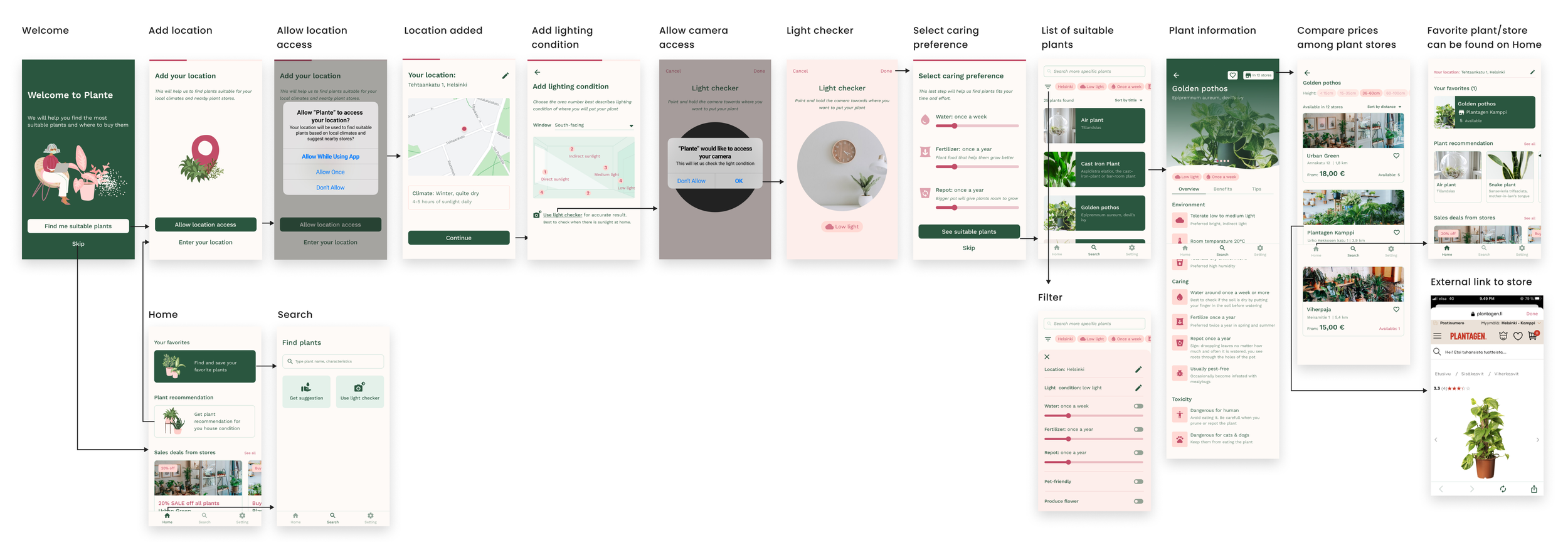
After the concept validation, we decided to skip buying process as the majority of people still prefer to go to a plant store to check and buy plants there. Without online purchasing, the product became much simple and straightforward and opened up the possibility of adding Identify plant to target Impulsive buyers by searching.
Main flow
Prototype
What I have learned
The main thing I have learned is to always validate design concepts early. It helps identify problems early and discover opportunities in order to avoid spending too much time and effort developing solutions users do not need.
With little time to focus on the project due to our work, there are many things still missing in the projects:
Other use cases, edge cases, the MVP still focuses solely on the happy path
Accessibility considerations
One more usability test to identify UX issues
